- Jena Barchas-Lichtenstein
- https://knology.org/person/jena-barchas-lichtenstein/
- Research Lead in Media; Meaningful Math Co-PI
- Presenter’s NSFRESOURCECENTERS
- Knology
- John Fraser
- https://orcid.org/0000-0001-8383-0699
- President & CEO
- Presenter’s NSFRESOURCECENTERS
- Knology
- Nicole LaMarca
- https://knology.org/person/nicole-lamarca/
- Researcher & Project Manager
- Presenter’s NSFRESOURCECENTERS
- Knology
- Patti Parson
- https://www.pbs.org/newshour/author/patti-parson
- Managing Producer
- Presenter’s NSFRESOURCECENTERS
- PBS NewsHour, WETA
- Laura Santhanam
- https://www.pbs.org/newshour/author/laura-santhanam
- Health Reporter & Coordinating Producer for Polling
- Presenter’s NSFRESOURCECENTERS
- PBS NewsHour
- John Voiklis
- https://knology.org/person/john-voiklis/
- Research Lead in Behaviors
- Presenter’s NSFRESOURCECENTERS
- Knology
Meaningful Math: News Media for Advancing Adult Statistical Literacy
NSF Awards: 1906802
2021 (see original presentation & discussion)
Adult learners, Informal / multi-age, All Age Groups
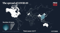
The news is full of complicated numbers - and that's only become more so with the COVID-19 pandemic. How does quantitative reasoning (QR) and mathematical confidence differ among different segments of the adult population? How can STEM journalists improve adults' QR and confidence through their reporting techniques?
Our transdisciplinary team of journalists and social scientists is conducting two kinds of experiments. The journalists are trying out different ways of presenting numbers, statistics, and the methods behind them - and the social scientists are looking at the effects on audience reasoning.
Related Content for Meaningful Math: Quantitative Reasoning and the News
-
 2017Reaching early career adults with science information
Julia Griffin
-
 2019Engaging Parents Through Social Science and Television News
Alicia Torres
-
 2015Cat Safety Invention-Informal Learning Via Engineering
Marisa Wolsky
-
 2015The Power of Implicit Game-Based Learning
Jodi Asbell-Clarke
-
 2019How to optimize STEM News consumption by early career adults
Julia Griffin
-
 2022From Moral Motives to STEM learning to STEM-informed action
Uduak Thomas
-
 2019Ruff Family Science
Mary Haggerty
-
 2018PLUM LANDING Explore Outdoors
Jessica Andrews
Playlist: AISL Videos Playlist
-
 2021Virtual professional development for community educators
Sue Allen
-
 2021Bird Cams Lab: Democratizing Science Collaboration
Miyoko Chu
-
 2021International Community for Collaborative Content Creation
Eric Hamilton
-
 2021Co-Creating Equitable STEM Research Led by Communities
Makeda Cheatom
-
 2021From Planetariums to YouTube: Taking Big Astronomy Online
Ryan Wyatt
-
 2021Informal STEM Facilitator Training Program
Ron Skinner
-
 2021Socially-Distanced Community Conservation Partnerships
Nicole Freidenfelds
-
 2021Story-Based Tinkering at Home: STEM Learning During COVID
Catherine Haden
-
 2021Bringing Out the Math in Making
Andee Rubin
-
 2021Food for Thought: Food Labs and Family STEM Learning
Bradley Morris
-
 2021(Un)Common Measures for OST STEM Learning
Karen Peterson
-
 2021Rethinking Our Assumptions about Storybooks and STEM
Scott Pattison
-
 2021Co-Designing a VR STEM Mystery Game w/ Neurodiverse Learners
Teon Edwards
-
 2021Virtual Citizen Science Expo
Nicole Colston
-
 2021WHIMC: Using Minecraft to Trigger Interest in STEM
H Chad Lane
-
 2021Adapting Crash Course for Bilinguals' learning in STEM
Kelsey Savage
-
 20213 Ways Embodied Learning Can Improve Informal Sci. Learning
Susan Foutz
-
 2021Math Corps 2020: Yes, We're Running!
Steve Kahn
-
 2021We are Water: Connecting Communities
Anne Gold
-
 2021Research on Museums, STEM & Social Issues
John Fraser
-
 2021Critical Making and Equity Research Coordination Network
Maria Olivares
-
 2021The SciGirls Strategies: How to Engage Girls in STEM
Rita Karl
-
 2021ChangeMakers: Youth led mentoring around food justice
Rajeev Rupani
-
 2021Code Crafters
Jordan Graves
-
 2021On-the-Spot Pivot to a Virtual Environment
Brian Kruse
-
 2021Increasing Access to Informal STEM Learning
Scott Bellman
-
 2021Understanding the Role of Intermediaries in Citizen Science
Haley Smith
-
 2021Meaningful Math: Quantitative Reasoning and the News
Jena Barchas-Lichtenstein


Martin Storksdieck
Director
The video nicely describes the issues, from the perspective of public stats/math literacy and from the perspective of how to address or deal with it in journalism and science communication. Can you share some of your initial findings? Judging from the extensive literature on risk assessment and formal math/stats education, I can imagine that expectations need to be low.
Jeremy Roschelle
Sasha Palmquist
Jena Barchas-Lichtenstein
Jena Barchas-Lichtenstein
Research Lead in Media; Meaningful Math Co-PI
Thanks! Love this question.
Some initial findings are available in this series: https://knology.org/article/numbers-in-the-news/
The overarching finding is arguably to be clear about what we don't know. We keep seeing that people really want to make inferences about why, so you have to tell them why they can't. And similarly, articulating & visualizing the uncertainty inherent in probability is key.
We've also confirmed others' finding that the news is, in general, full of statistics -- and we found more in economic in health reporting than science or politics (which we included because we collected the data in a presidential election year). We're also currently analyzing a survey about the links between people's quantitative reasoning and news consumption.
I'm also hoping my colleague John Voiklis will comment in more detail on the findings here!
George Hein
Kristin Flaming
Heather Masson-Forsythe
John Voiklis
Research Lead in Behaviors
Hi Martin,
I too love your comment about expectations.
As a (social-)cognitive scientist, I came into this project expecting that news audiences would take away from the news what they expected was there to take away. In other words, I expected to see lots of reasoning based on prior knowledge about how the world operates--what has been called Bayesian rationality* (see the work of Nick Chater, maybe Gerd Gigerenzer, and their colleagues). What was true yesterday is true today will be true tomorrow. For most seemingly constant happenings in the world, that's a safe bet. Whether the "new" information is quantitative or not, people find the evidence that matches their expectations (sort of but not exactly what is called "confirmation bias").
As Jena pointed out, this kind of reasoning is rampant in the series of studies we're calling Numbers in the News. People draw inferences from the news that go well beyond the given (quantitative) information. One detail that is missing from the online reports (but will appear in fuller write-up) is how early this starts happening in the reasoning process. Our model of drawing inferences from the news follows a path that starts with people figuring out the topic of the story, then deciding if the perceived topic matters to them or those they care about, from which they judge the credibility of the story on the perceived topic, before drawing any inference. Prior experience, prior knowledge, prior commitments take effect immediately with topic perception. For example, mention the name of a politician in a paragraph that also reports the various ways to estimate the unemployment rate and some people will perceive criticism of the politician as the topic of the story rather than the headline topic about unemployment numbers. The reasoning process then proceeds from that perceived topic.
Jena also mentioned our study looking at the likely relationship between people's quantitative reasoning and their news habits. We are still in the thick of the analysis, so I can't really talk about findings, as yet. But, one interesting tidbit is that we can reliably segment participants based on their news habits. For example, there was a group of avid news users who rely primarily on the NY Times and Washington Post. While I find the notion of an "echo chamber" poorly specified, it could serve as a useful starting point for connecting these segments to people's quantitative reasoning. One source of prior expectations comes from one's reference group (aka social norms). In the so-called "echo chamber", news sources can serve as badges of group membership and amplify the norms of the reference group. In my prior work on analyzing the (moral) norms expressed in the news and opinion, I found that "straight news" (as opposed to opinion) didn't outright tell people what they should think. Perhaps, though, they limit what people can think--the available information and how deeply they should consider that information. The third study Jena mentioned is our text analysis of how a large sample of news stories from various sources use numbers and what quantitative reasoning skills they expect from their audiences. It might be that the amount of quantitative reasoning required to make sense of a story implicitly tells the reader, viewer, listener how deeply they need to reason about those quantities. But here I am getting into questions for a followup study. The existing data won't answer the question of whether and to what extent the quantitative demands placed on audiences might set expectations and delimit the depth of reasoning.
The problem with Bayesian rationality is that it sometimes (some might say often...though not I) leads people astray. How to fix this? There are many suggestions in the literature on probabilistic reasoning, but most of those suggestions require more time and resources than news providers can or should devote. For the news, we need a simpler and quicker mechanism. I want to reinforce what I said in the video and Jena repeated in her reply: "articulating & visualizing the uncertainty inherent in probability is key." Why? Because uncertainty is an invitation to pause and reflect. It is true that expressions of uncertainty can make people less certain about particular aspects of message credibility (a topic for another time and place). Nevertheless, pausing for a breath of time to reflect yields benefits to reasoning that would be a bargain at twice the price (for example see the work of Pennycook and Rand onthe role of reflection in detecting misinformation & so-called “bullsh!t”).
* For the technically inclined, I should clarify: I am not arguing that people actually perform formal Bayesian analyses in their heads. After all, it has been widely demonstrated that people are prone to ignore the base rate occurrence of a phenomenon--e.g. how often people in their 60s suffer strokes absent receiving any new vaccine. But at the conceptual level, prior experience, prior knowledge, prior commitments, etc. can easily take the place of quantitative base rates (aka prior probabilities) in everyday reasoning.
Jena Barchas-Lichtenstein
Amy Alznauer
Kristin Flaming
Jena Barchas-Lichtenstein
Research Lead in Media; Meaningful Math Co-PI
Hi everyone. Meaningful Math is a four-year NSF-funded collaboration between PBS NewsHour and Knology to produce better quantitative news content.
This grant provides a too-rare opportunity to reflect on how we are telling stories and to think critically about ways we do that better. We benefit, but more importantly, the ultimate goal is that our audience benefits, absorbing a more meaningful sense of the data and numbers that surround us every day.
We're right at the halfway point, and here are some things we're especially proud of thus far.
On the news production side:
On the research side:
Together, we're currently working on:
Amy Alznauer
Katie Sandlin
Kristin Flaming
Kristin Flaming
This is such an interesting and much needed project Jena. We emphasis in our Passion-Driven Statistics model about telling a story with the data to our students at all levels. I look forward to exploring your links to see how we can improve how our students tell their story to improve audience understanding.
Are you finding that journalists not involved in the project/do you expect are interested in improving how the deliver the news to improve audience QR? Kristin
Jena Barchas-Lichtenstein
Zach Mbasu
This is such an excellent project! Citizens require the means to inform themselves as well as adequate skills to interpret the information correctly. In countries such as Kenya where I come from, the data literacy/numeracy of citizens is undeveloped. Interpreting quantitative information remains a huge challenge as most citizens are not able to recognize key statistical concepts and thus prone to draw incorrect conclusions. It would be interesting to see whether these tools could be adapted and used in developing countries and contexts like Kenya. Thank you.
Amy Alznauer
Holly Morin
Patti Parson
Jena Barchas-Lichtenstein
John Fraser
Jena Barchas-Lichtenstein
Research Lead in Media; Meaningful Math Co-PI
I absolutely love this question, and we are definitely hoping it's widely applicable.
There have been a lot of interventions for journalists that focus on journalists' own understanding & literacy but not on the skills to present information in a way that makes it easier for their audiences to draw the right inferences. I definitely think some of the ways we're looking at visualizing uncertainty are broadly applicable, for example.
A huge benefit of our project is that it's led by PBS NewsHour, which is the most trusted public news outlet we have in the U.S. I have to admit that don't know anything about the news landscape in Kenya - where do people get information from? Is there public media that's widely trusted? I'm hesitant to speak to the applicability anywhere that I don't have a good sense of the news.
I also have a big caveat: I'm always a little nervous about 'literacy' in and of itself as an intervention - since a lot of misinformation also comes from people who have the analysis skills but are skeptical of institutions. (Are you familiar with Crystal Lee's work on COVID-19 misinformation? https://news.mit.edu/2021/when-more-covid-data-... is a nice overview.) That is, we can only do the work we're doing because of NewsHour.
Amy Alznauer
Kristin Flaming
Amy Alznauer
Lecturer
I found the link you provided absolutely fascinating. This gives me a deeper understanding of the "literacy is not enough" claim. The article you linked, links to their actual study, "The Data Visualizations Behind COVID-19 Skepticism."
Jena Barchas-Lichtenstein
Jena Barchas-Lichtenstein
Research Lead in Media; Meaningful Math Co-PI
Their work is so, so, so good. I always try to point to the structural issues, even though we have the incredible luxury of working with a news organization that's extremely well trusted across the ideological spectrum. It's not an either-or!
Amy Alznauer
Lecturer
Hi Everyone! About a decade ago, I spent five years developing and teaching quantitative reasoning courses as DePaul University, so I’m just thrilled to see this project underway. In particular, I once partnered with the Chicago Tribune to follow homicide data in the city in real time. So again this is just fantastic. The impact here seems to be two-fold: changing how journalists report in order to maximize reader/viewer understanding (in an equitable and inclusive way). In other words, the impact is on both journalistic practice and on public understanding. But I’m wondering if you’ve considered as part of this project any collaborations with educational entities (schools, colleges, …) in order to work toward a more quantitatively literate viewing public. And furthermore, might the insights from educational efforts in this realm possibly aid your investigation, and in turn might your findings be invaluable to quantitative reasoning courses? It seems to me you could amplify the impact of this fascinating project by bringing your findings into educational programs at various levels. Alternately, has there been any talk of developing a quantitative literacy program through the PBS website, that would capitalize on quantitative information in your stories and use them as small teaching and exploration modules that would be open to teachers and educators to use in the classroom? Your program is fascinating without these explicitly education-based components, but as someone who taught QR for years, it is hard not to long for your research to explicitly intersect with the classroom. I’d love to hear your thoughts.
Kristin Flaming
Jena Barchas-Lichtenstein
Jena Barchas-Lichtenstein
Research Lead in Media; Meaningful Math Co-PI
Another great set of questions! We've definitely been looking at the literature on formal learning as well, and always love recommendations. As I see it, this project sits at the intersection of a lot of bodies of literature:
It's a lot to keep up on, and we're always trying to connect the dots.
In terms of interventions, we're working specifically with adults, and we're funded through the AISL program, which is specifically for informal learning. That said, there are a ton of opportunities for us to expand this work, and I love the idea of supporting formal educators too. The best people to weigh in on possibilities for the future are my PBS NewsHour colleagues - especially Patti Parson and Leah Clapman, who runs all of PBS NewsHour's work with formal education, including Student Reporting Labs.
Amy Alznauer
Kristin Flaming
Jan Mokros
This project brings new, and positive meaning to the term "armchair epidemiologist." You are doing a lot to help all of us amateur scientists understand what's happening in a quickly changing environment. I would like to know more about who you are reaching. I love the idea of a quantitative literacy program through NPR. This is where those who are interested will go to deepen their understanding. On our project, "COVID-Inspired Data Science and Epidemiology" (see #1984), we're trying to do something similar with young teens.
Jena Barchas-Lichtenstein
Jacob Sagrans
Jacob Sagrans
I agree, wonderful project! Here's the direct link to our "COVID-Inspired Data Science for Youth" video if you'd like to check it out. Thanks! https://stemforall2021.videohall.com/presentations/1984
Patti Parson
Jena Barchas-Lichtenstein
Amy Alznauer
Lecturer
Jacob, I'm so glad you posted here. I thought when viewing both of these project that there could be some overlap. Since I am interested in the education potential of this PBS project - not just through the articles themselves (which is the goal of this project) but through direct engagement with students - I thought it would be nice for your two projects to be connected.
Jena Barchas-Lichtenstein
Research Lead in Media; Meaningful Math Co-PI
Oh, wow, Jan and Jacob - speaking from the research side, your project looks amazing! I'm really looking forward to learning more, and I'm sure my colleagues on the PBS NewsHour side will have a lot more to say too.
George Hein
Professor Emeritus
This is an important project for obvious reasons: from the perspective of rational, data driven decisions, it's hard to understand how so many people accept unfounded or incorrect statements. It may be interesting to challenge viewers with presenting statistical data in different forms. Showing a bar graph with its numbers may have a different effect that showing a pictogram where the numbers are represented by images of little human figures, for example.
Are you familiar with the work of Otto Neurath, an Austrian scientific philosopher (member of the Vienna Circle) who invented the symbols we use universally on road signs and to describe multitudes of people or objects? He actually created a museum intended to explain economic data about countries or cities all with what he called Isotypes?
Amy Alznauer
Jena Barchas-Lichtenstein
John Voiklis
Research Lead in Behaviors
I knew about Otto Neurath's work but could never remember his name. Thank you; knowing the name will help with the literature searches intended to inform ongoing studies in the Numbers in the News series of studies (https://knology.org/article/numbers-in-the-news/). That series has begun to systematically test several verbal and graphical manipulations of quantitative information that may improve quantitative reasoning.
Patti Parson
Managing Producer
I love your project Jacob and Jan...what a wonderful way to engage kids with data, while also teaching them about how to better understand what is going on in the world (and maybe teach their parents!). I'd love to see a copy of the book you wrote, Jan! The Meaningful Math part of our program at PBS NewsHour is aimed at those 18+. We know our audience is evenly split among those who identify as conservative, liberal and middle of the road, so hopefully what we learn from the research Jena and others at Knology are doing will help us better communicate to them.
Michael Belcher
This is a fascinating project! As a math educator, I'm a little embarrassed to admit that I have been baffled by one New York Times data representation since the start of the pandemic - I clearly need to improve my data literacy!
I love that your project focuses on communicating through data representations. Similar to several of the other commenters, I wonder, how might your work inform K-12 education relating to building and communicating with data representations? I couldn't tell from the video, but is this part of your project? If so, what have you learned about students' use and understanding of data representations? If not, what suggestions do you have for teachers trying to support their students to develop this type of data literacy?
Thanks and great work!
Jena Barchas-Lichtenstein
Amy Alznauer
Lecturer
Yes, thank you for this Michael. Your questions here - "I wonder, how might your work inform K-12 education relating to building and communicating with data representations? I couldn't tell from the video, but is this part of your project? If so, what have you learned about students' use and understanding of data representations? If not, what suggestions do you have for teachers trying to support their students to develop this type of data literacy?" - are exactly mine.
This is such a focus in education right now and so would just love to see if there is outreach/overlap in that direction with this project.
Jena Barchas-Lichtenstein
Jena Barchas-Lichtenstein
Research Lead in Media; Meaningful Math Co-PI
Michael, I'm curious to hear which visualization in particular you find baffling! We started this project in summer 2019 and by, oh, January 2020 it started to feel like an epidemiology crash course. So I very much feel your pain.
We're not working directly with K-12 educators yet! But I think many of us would be interested in expanding - and PBS NewsHour already does a lot of formal education work too. There's so much room to build and I am very much looking forward to it.
Are you thinking about a particular age or particular topic area? Would love to continue thinking together!
Amy Alznauer
Laura Santhanam
Michael Belcher
Thank you for asking! The NY Times data representation is one they still have up near the top of their website. It shows the daily number of COVID cases and deaths, a percent change relative to a 14 day average, a trend line showing whether the numbers are increasing or decreasing, and a heat map showing changes by state. Since the start of the pandemic, it seemed like every time I looked at it, both cases and deaths were decreasing. I even made a spreadsheet to see if I could figure out how the numbers were calculated and I could not make my numbers match. I've been struck by just how important this representation is because it can send conflicting messages about safety depending on how you interpret it. Especially the seemingly always downward pointing trend line making it seem like we've always had things under control. Until you mentioned it below, I had never thought about the importance of getting people (me included) to slow down when looking at a representation - that's such a good point. From a news angle, how do you contend with a fast-scrolling approach to news? Do you think people will slow down or will they just ignore a representation if it is too complicated? These are the types of trade-offs that I think students should contend with as well.
In terms of K-12 education, I would love to see this type your work in middle school where students start working with representing data variability. I love how this context introduces real stakes for representing data - it becomes more than just reporting information. The journalistic angle makes it also about effective communication. I also like that your project could expand students' toolbox of representations and open the space for them to invent new representations.
Jena Barchas-Lichtenstein
Jena Barchas-Lichtenstein
Research Lead in Media; Meaningful Math Co-PI
If I remember right, the NYT is looking at 14-day change in what is itself a rolling 7-day average? Something like that? And now the heat map has changed to vaccination status - but I have no idea if the denominator is total population or eligible population (which just jumped this week with the approval for adolescents).
Okay, I got curious, so I clicked through to https://www.nytimes.com/interactive/2021/us/cov... and found the little 'about this data' button, which says: "Sources: State and local health agencies (cases, deaths); U.S. Department of Health and Human Services (tests, hospitalizations). Tests, hospitalizations and deaths show seven-day averages. Hospitalization data may not yet be available for yesterday. Number of average tests may not include tests from some states for the most recent days. 14-day change is hidden if not enough data is available to make a comparison. Figures shown are the most recent data available." And for vaccines the denominator is total population, including children who are not yet eligible.
But to your question, I don't know how many people are going to go full 🤓 like me and click through until they find the explanation. And I've never tried to check it myself, so I love hearing that you did!
On the one hand, I'm so glad to see more and more news orgs are using techniques to account for natural variability and make numbers more comparable (e.g. rolling averages to account for reporting delays on weekends; population-adjusted numbers rather than absolutes).
On the other hand, these are mathematically sophisticated techniques, and I wish there were more (& more visible) explanation of both WHY and HOW.
John Voiklis
Research Lead in Behaviors
Hello Michael: When I made my comment above, I was thinking about getting people to slow down their inferential process--to look before they leap to conclusions, so to speak.
How do you get people to slow down their fast scrolling? That's a good question. I would argue that scrolling through a news feed is itself an inferential process, with many rapid classifications: "know it, know it, don't care, don't care, boooring," and so on until you reach "hey, wait a minute, what's this about?" There are myriad design tricks for that, and some of them must use uncertainty of some form to prompt people to hover for a moment. Attention though is like a superbug and quickly becomes immune to overused tricks. The thing is, while news providers may want audiences to linger over everything they publish, people have limited time and cognitive resources. They cannot linger over every story. The real trick is to get them to reflect a little more and a little longer over what has caught their attention.
George Hein
Professor Emeritus
Going back to John's detailed response, yes "uncertainty" is a crucial factor in our reasoning. But of the examples shown in the video there is never even a reference of the statistical margin of error associated with the values presented. And then there is the uncertainty in the data itself (a big factor contributing to uncertainty). Has there been any research on whether it makes a difference in viewers interpretation of data if data is shown along with margins of error? Might there may be a significant difference in viewer's' understanding if quantitative data is always presented with an estimate of the error range?
Jena Barchas-Lichtenstein
Jena Barchas-Lichtenstein
Research Lead in Media; Meaningful Math Co-PI
From a research perspective: we've been testing this very question, and here's what we're seeing so far. In general, showing ranges rather than point estimates helps people who don't have as much background - and doesn't hurt those who do. It lowers people's PERCEIVED understanding but improves the inferences they draw -- which might suggest that the additional visual complexity is getting people to slow down to process the numbers:
https://knology.org/article/numbers-in-the-news...
We also are seeing consistent evidence that at least some people interpret references to "official" or "government" statistics as being somehow better or more true, which is also a challenge:
https://knology.org/article/numbers-in-the-news...
We've also published a piece about navigating the epistemic uncertainty involved with all statistics, above and beyond the probabilistic uncertainty:
http://www.americananthropologist.org/2021/04/1...
Would you be interested in hearing about the news production side and the day-to-day conversations and discussions happening there? I know our PBS NewsHour colleagues have tons to say about that piece of the puzzle.
Amy Alznauer
Laura Santhanam
Laura Santhanam
Health Reporter & Coordinating Producer for Polling
Thanks so much, George and Jena. The PBS NewsHour and Knology have been thinking a lot lately about how to accurately and effectively convey margin of error, particularly in polling results from the PBS NewsHour's partnership with NPR and Marist Poll. The video above was submitted before we had published our latest effort, but here is a link where we used shading to show the MOE range in a bar chart in an April 15 poll release.
https://www.pbs.org/newshour/politics/bidens-po...
We are also thinking about how to share MOE in different chart templates. This conversation about developing more creative yet streamlined ways to display MOE is on-going, and I'd love to see examples if you have some favorites in mind, George! Thank you again for your comment!
Holly Morin
"Literacy alone is not going to solve everything..."- such a profound statement. People need to not only understand the meaning of data and information provided in the media, but also recognize and trust the provider/publisher. This is SUCH an interesting and critical project at a key time for our society. I look forward to seeing the future efforts of this project!
John Fraser
Jena Barchas-Lichtenstein
Laura Santhanam
Health Reporter & Coordinating Producer for Polling
Thank you so very much for the lovely feedback! It is certainly exciting to ask and answer questions that touch on those very real issues in statistical literacy and news consumption and comprehension. We look forward to being able to share more approaches as this project continues!
Jena Barchas-Lichtenstein
Amy Alznauer
Lecturer
Jena, you asked: "Would you be interested in hearing about the news production side and the day-to-day conversations and discussions happening there? I know our PBS NewsHour colleagues have tons to say about that piece of the puzzle."
Laura, I think you were responding to George and not this, so as a huge PBS NewsHour fan and someone generally fascinated by this discussion, I'd love to hear a bit more on this topic from any of you.
Jena Barchas-Lichtenstein
Laura Santhanam
Health Reporter & Coordinating Producer for Polling
Thanks so much for raising the question, Amy. When it comes to daily conversations that lead up to news production, we are increasingly working to factor in how to build statistical awareness, competency and comprehension in our coverage -- both in the newsroom, across beats and for our audience. News serves as a source of active learning throughout adulthood. It is an idea we want our work to serve, and this project provides such an opportunity.
To that end, editors at the PBS NewsHour ask these questions whenever they are working with a reporter who has submitted a draft for a story or graphics. We are working with Knology to develop a list of do's and dont's to offer quick-glance guidance for journalists on deadline but who still have to get the numbers (and related certainty/uncertainty) right in their reporting.
Thinking about how to show uncertainty in vaccination data when we know there are reporting gaps for race and ethnicity and concerns about equity in the U.S. vaccine rollout, we have launched a/b testing to gauge statistical understanding, different versions of graphics conveying these data. We began this test via the PBS NewsHour's science email newsletter, focusing on responses from people who are considered active users (they opened the last five newsletters) and offered a Google Form where those users could offer critiques about the graphics. We are working to develop alternative graphics that respond to strengths and challenges users raised, along with our own insights from existing and on-going research, and have mapped out plans to launch the next iteration of that data graphic series. The ultimate plan is to provide a resource for accountability that can also inform reporting as the nation works toward gaining control over the COVID-19 pandemic.
The hope is that through these collective efforts, we improve our process in meaningful ways through these efforts so that we can build templates that can be quickly used by journalists on deadline but who also know that it is critical to share these data in ways that matter to our audience, whether we're reporting on public health, space exploration, economic renewal, social justice and more.
Jena Barchas-Lichtenstein
Amy Alznauer
Lecturer
Thank you for these responses Patti and Laura. All of this strikes me as so compassionate and also such a broad approach to the problem. You are not only trying to address the quality of the data itself (including issues of equity and inclusion) and how the data is presented, but thinking hard about the framework within which the data is received (what are the preconceived ideas about government, science, other sources of authority etc, that affect reception). All of this has really opened my eyes to the problem of quantitative literacy. It is not merely (or in some cases even primarily) a problem of education. It is also a problem of presentation and reception. By studying how people receive and interpret data, you are seeking meaningful ways to intervene in our the public's comprehension of quantitative information. And again I say this is compassionate because you are not blaming the viewing/reading public for failing to understand the data you offer, but rather you are trying to improve things from your end. I'm so impressed with this project and with the energy and sincerity of this conversation here.
John Fraser
Jena Barchas-Lichtenstein
Patti Parson
Managing Producer
Thanks so much, Amy. It really helps to hear such supportive words and give us new energy going forward.
Patti Parson
Managing Producer
In addition to what Laura has laid out, before we do any story for broadcast or our website/social media, we make sure to assess the data upon which it is based. We discuss how trustworthy is the source, whether its conclusions follow from the numbers they cite and whether it's an outlier or part of a larger trend. Then, as Laura says, when we start producing we make sure we get the data and concept right - all scripts, all words we write, go through many layers of editing. The information we are learning from Knology's research is proving invaluable for guidance for writers and editors alike.
Jena Barchas-Lichtenstein
Fritz Smith
Such an interesting project. I thought it was insightful how the video mentioned literacy might not be sufficient, because just being able to read may not mean that everyone can understand graphs and statistics. Numbers, graphs, and statistics are forms of communicating information. It is equally important for reporters to understand how to communicate what numbers and statistics mean, and to not use charts and graphs to mislead people.
John Fraser
Jeremy Roschelle
Jena Barchas-Lichtenstein
Ning Wang
Interesting perspective, thanks for all the great materials!
Jena Barchas-Lichtenstein
Patti Parson
Managing Producer
Thanks everyone for watching and for all the thoughtful comments. Much to think about, going forward.
Josephine Louie
What a great and important project! I love that you are working directly with journalists - the messengers who shape the news and help the public build its understanding of the world.
Our project works directly with high school students to build their statistical thinking and data literacy skills by investigating social justice issues using social science data sets. We hypothesize that students' critical data reasoning skills will improve if they learn to investigate and make sense of data about important social issues themselves (using data whose sources and collection methods they interrogate). It would be so eye-opening for students to see and realize that journalists must learn these same skills to share data with the public. And to consider how words, graphics, scale, and other presentation decisions can influence the stories that people take away from data in the media. I'm so glad I found your video - I'd like to find out what you learn as your research continues. And possibly incorporate your findings (and stories about helping journalists learn data skills) into our work with students and teachers!
Jena Barchas-Lichtenstein
Research Lead in Media; Meaningful Math Co-PI
I loved your video as well - getting students to tackle problems that they're interested in seems like the best possible way in. I'd be curious to learn more about how you're evaluating the students' critical reasoning skills, and would love to hear more about your findings as well! Let's try and keep in touch about what we're doing?
Josephine Louie
In our project we've been measuring growth in students' academic interests in statistics and data analysis with pre & post-tests adapted from existing validated scales and assessments. Because we're an early-stage project, we've also been collecting classroom observation, teacher and student survey and interview data, and student work. Yes, let's stay in touch about what our projects are doing and learning!
John Fraser
Further posting is closed as the event has ended.